Most teams know they should be tracking their live stream performance. The problem is not access to data. It is knowing which numbers actually tell you something useful versus which ones just feel good to look at.
This guide cuts through the noise. Whether you are a content creator trying to grow an audience, a marketing team measuring campaign impact, or a host optimizing a live programming strategy, these are the metrics that drive real decisions and how to act on what they tell you.
The 4 Metrics That Actually Matter
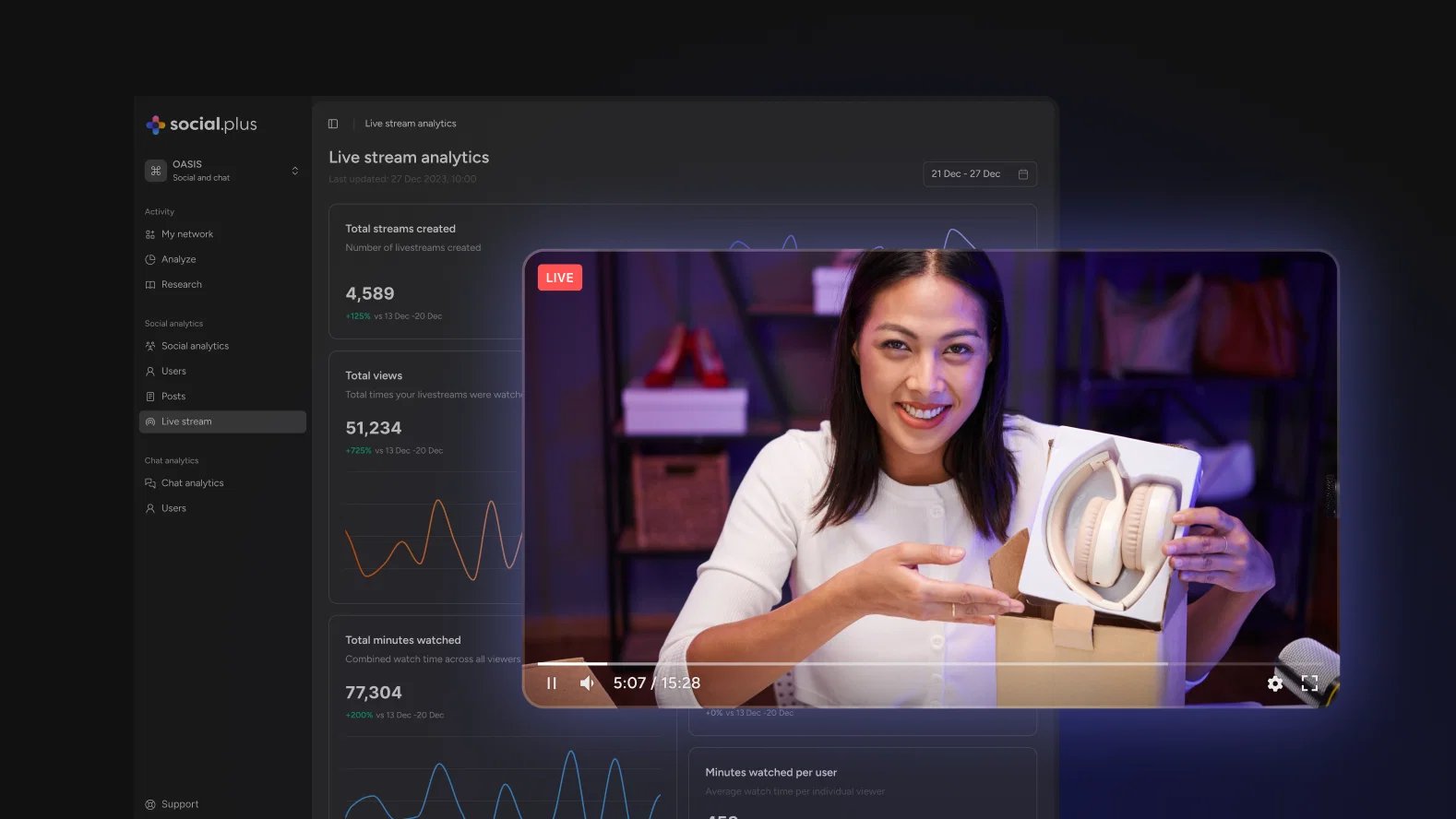
1. Total Views
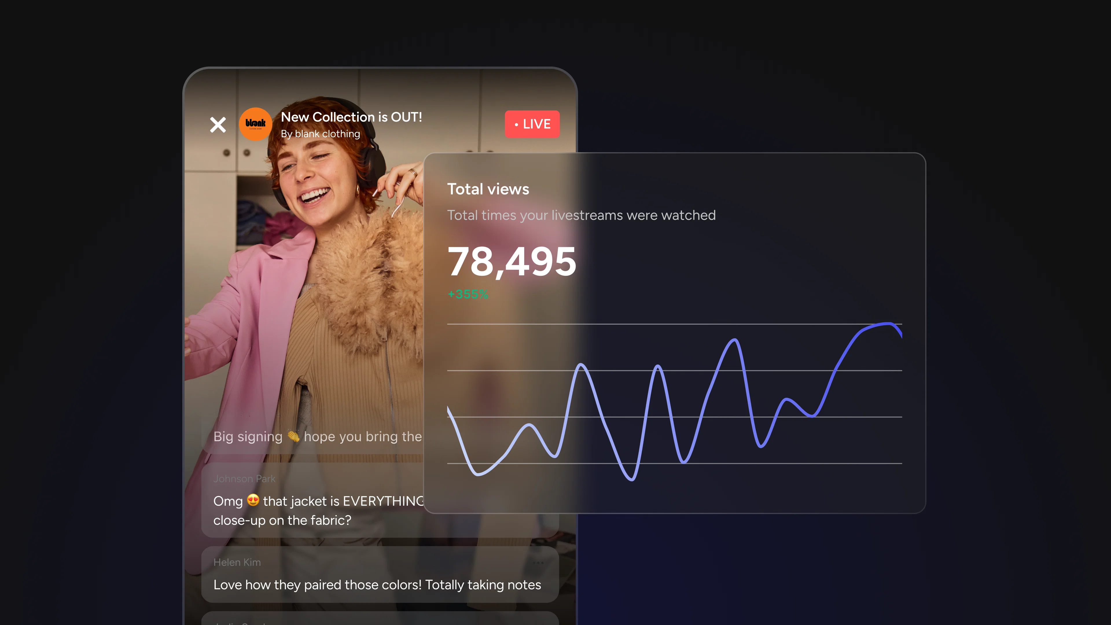
Total views is the number most people lead with, and for good reason. It is the fastest read on whether a stream landed in front of people. If you ran a promotional push before going live, this is where you see whether it worked. If you changed your publish time or tried a new title format, total views is the first signal of whether that test paid off.
Where teams go wrong is treating it as a performance metric rather than a reach metric. Total views tells you about distribution, not quality. A stream that got 5,000 views because it was featured or shared is a very different result than a stream that earned 5,000 views from a loyal audience who actively sought it out. The number looks identical. The implications are not.
Watch for: Total views rising while unique viewers stay flat often means the same people are coming back repeatedly, which is actually a strong loyalty signal worth paying attention to. Total views rising while minutes watched drops is the opposite story: wider reach, weaker content.
2. Unique Viewers
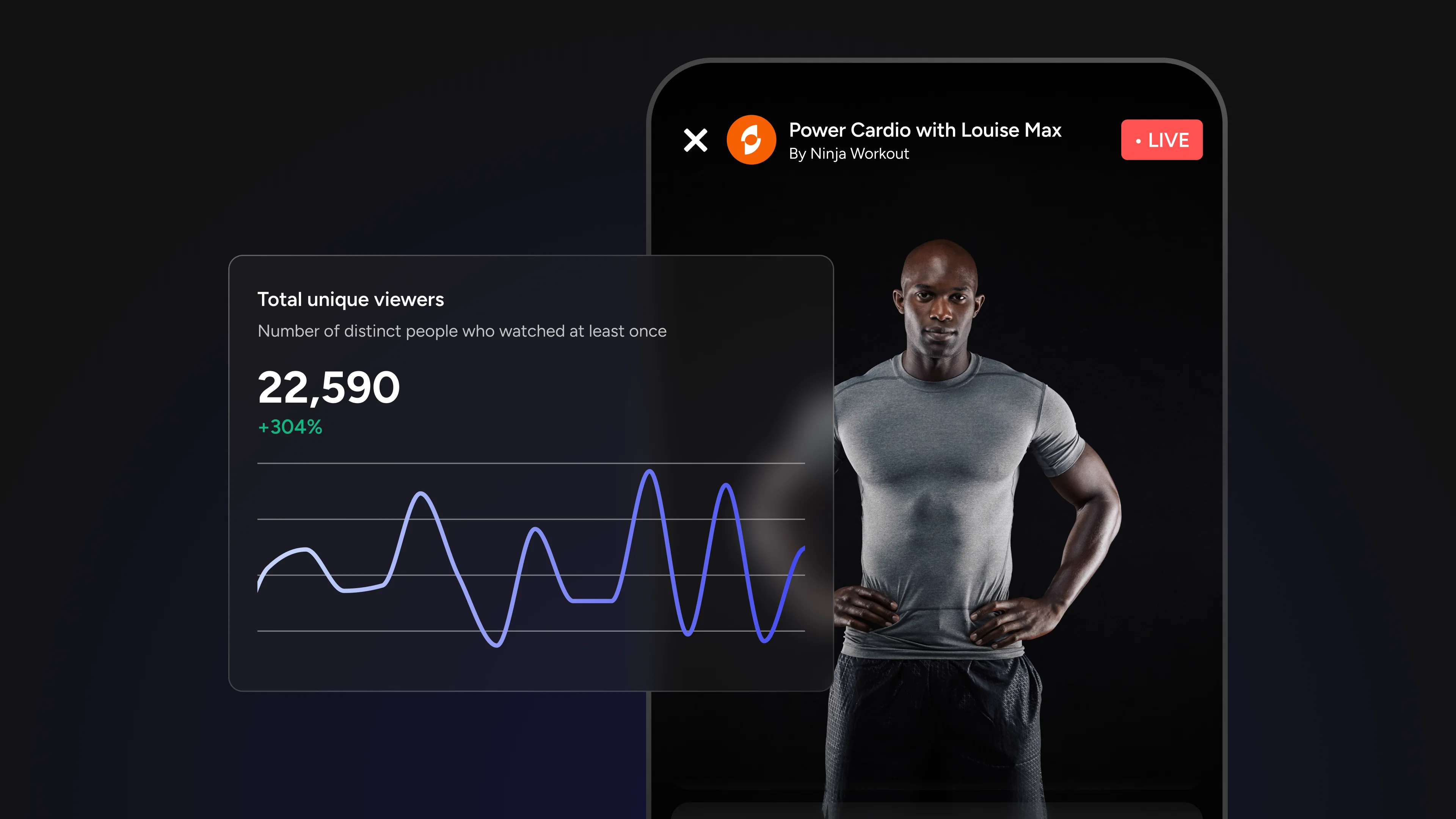
Unique viewers tells you your actual reach: how many distinct people tuned in, regardless of how many times they dipped in and out. This is the metric that matters for audience-building.
Compare total views to unique viewers. A ratio of 2:1 or higher suggests your audience is returning or re-watching, a strong signal of content they value. A near 1:1 ratio means most people only showed up once.
Watch for: A growing unique viewer count over time is the clearest sign your audience is expanding. Plateauing unique viewers despite consistent streaming often points to a discoverability problem, not a content problem.
3. Minutes Watched
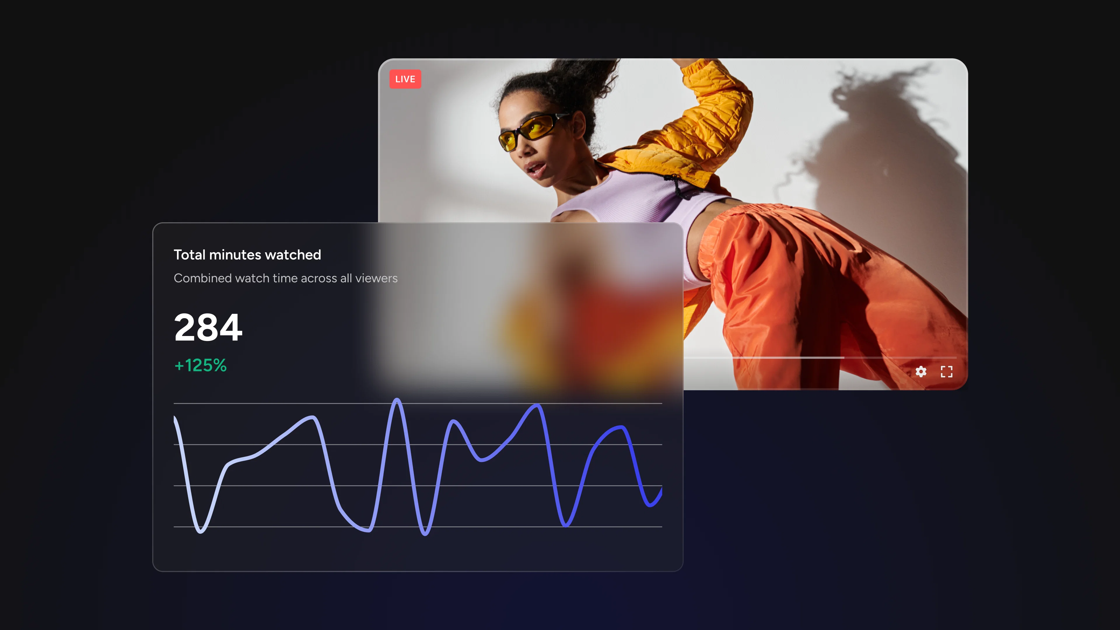
Minutes watched is your depth metric, the aggregate of all the time your audience spent with your stream. A stream with 500 viewers who each watched for 45 minutes produced 22,500 minutes watched. A stream with 2,000 viewers who each watched for 3 minutes produced 6,000.
Which stream performed better? By total views, it's the second. By actual audience investment, it's not even close.
Watch for: Track minutes watched as a trend over time. Consistent growth here means you're earning more attention per stream, the compounding signal of improving content.
4. Minutes Watched Per User
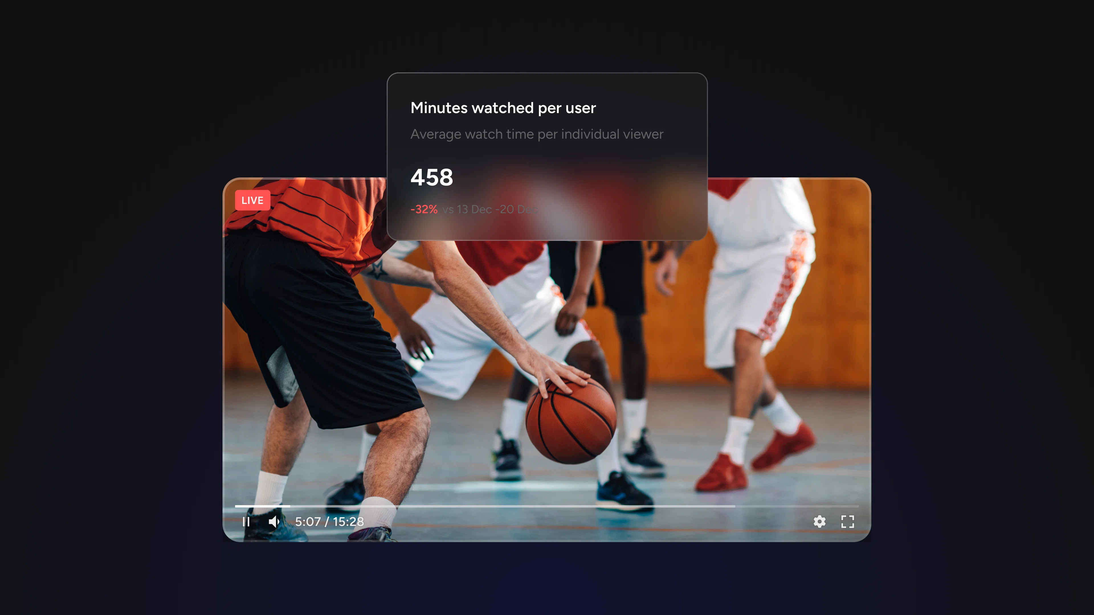
This is the metric most teams underestimate, and the one that tells you the most. Where total minutes watched shows aggregate time, minutes watched per user shows average engagement depth.
It answers the question: are viewers actually leaning in, or just passing through?
A high minutes-watched-per-user tells you your content is holding attention. A low number, even paired with strong view counts, is a clear signal that something in the stream is not keeping people.
Watch for: Use this number as your primary quality benchmark when comparing streams. Not every stream needs to score the same. A 90-minute product deep-dive and a 15-minute news update will naturally look different.
Compare Streams to Find What's Actually Working
One of the most common analytical mistakes in live streaming is evaluating each stream in isolation. A stream that pulled 800 unique viewers sounds strong, until you realize your last three streams averaged 1,400.
Percent-change comparisons across time periods transform raw numbers into context. When you can see how your reach and engagement trends move relative to previous periods, last week, last month, the past quarter, you stop reacting to individual data points and start reading patterns.
Questions you can only answer with comparison data:
• Is our audience growing, shrinking, or holding steady?
• Did a format change improve or hurt engagement?
• Is the content type we doubled down on last month actually working?
• Which day and time consistently outperforms others?
Livestream Analytics lets you select date ranges across the last 7 days, 30 days, or up to 3 months, giving you the flexibility to zoom out for strategic review or zoom in on a specific campaign window.
The Minute-by-Minute Breakdown: Your Content Feedback Loop
Aggregate metrics tell you what happened. The minute-by-minute breakdown tells you why.
When you drill into an individual stream's timeline, you can see exactly when viewers tuned in, when they dropped off, and when engagement spiked. This is where abstract performance data becomes a concrete editing and production guide.
Three things to look for in a minute-by-minute view:
The first-five-minutes drop. Most streams lose a significant portion of their audience in the opening minutes. If your chart shows a steep early decline, your intro isn't earning attention fast enough. The fix is usually structural: lead with value, not setup.
Mid-stream dips. A drop in the middle of a stream often corresponds to a topic transition, a slower segment, or a technical issue. Cross-reference the timestamp with your stream notes to identify what was happening at that moment.
Engagement spikes. Moments where viewers lingered or where engagement jumped are as important as the drop-offs. What were you doing at that timestamp? More of that.
Pro tip: Build a habit of reviewing the minute-by-minute breakdown immediately after every stream, while your memory of the content is fresh. The pattern recognition compounds over time.
Putting It Together: From Data to Strategy
The goal of analytics isn't to generate reports. The goal is to make better decisions about future content. Here's a simple review process to run after each stream:
- Check total views and unique viewers against your trailing average. Are you growing, stable, or declining?
- Compare minutes watched per user to your benchmark. Did this stream hold attention better or worse than usual?
- Pull up the minute-by-minute breakdown. Note the timestamps with the steepest drops and the highest spikes.
- Log one concrete thing to change next time: a different opening, a tighter segment, a more interactive moment at a point where you typically lose viewers.
Small, consistent adjustments informed by real data compound into a dramatically stronger content strategy over time.
See It in Action with Livestream Analytics
Livestream Analytics puts all of this in one place: real-time metrics during your streams, aggregate performance views with percent-change comparisons across custom date ranges, and minute-by-minute breakdowns for every individual stream.
If you've been making content decisions based on instinct alone, this is your data layer. Start with a single stream review and let the numbers show you what to do next.