Most live stream analytics dashboards will show you a total view count and maybe a peak concurrent viewer number. Those numbers are easy to read and easy to report upward. They are also the most misleading metrics on the screen.
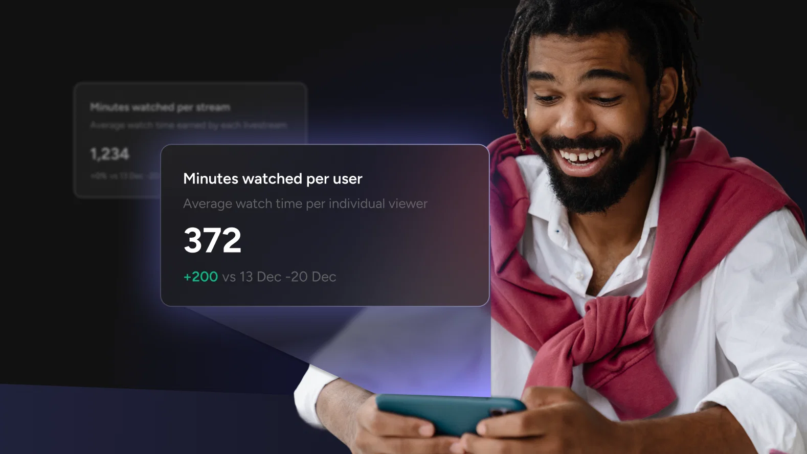
Minutes Watched Per User cuts through all of that. It is a single number that answers the only question that actually matters about your content: when people showed up, did they stay?
The average viewer spends 25.4 minutes watching live video per session, compared to around 19 minutes for on-demand content. That gap exists because live streaming, by its nature, creates urgency and presence that recorded content cannot replicate. But that baseline also means your audience is coming in with a higher tolerance for time investment than they bring to any other content format. Minutes Watched Per User tells you whether you are earning that tolerance or squandering it.
What Minutes Watched Per User Actually Measures
Minutes Watched Per User is calculated simply: total minutes watched divided by unique viewers. But what it measures is something more nuanced than arithmetic.
Think of it this way. Total views tells you how many people opened the door. Minutes Watched Per User tells you how long they stayed in the room. A stream with 10,000 views and a Minutes Watched Per User of 2 minutes produced a fundamentally different result than a stream with 2,000 views and a Minutes Watched Per User of 22 minutes. The first had reach. The second had an audience.
The distinction matters because reach and audience are not the same thing. Reach is what you buy or borrow from promotion, distribution, or a lucky algorithmic moment. Audience is what you earn with content that holds attention. Only one of those compounds over time.
What Does a Good Number Actually Look Like?
This is the question every team asks and the one that is hardest to answer with a universal number, because context shapes the benchmark entirely. A 10-minute product walkthrough and a 90-minute keynote should not be held to the same standard.
What you can do is build your own benchmarks from your own data. Here is a practical starting framework:
Your first benchmark is your own stream history. Before comparing yourself to anyone else, establish your rolling average across your last 10 streams. That number is your baseline. Every stream should be evaluated against it, not against some industry figure from a content category that may have nothing to do with yours.
Your second benchmark is format-adjusted. Group your streams by type, Q&As, product demos, educational content, live events, and track Minutes Watched Per User separately for each. A format that consistently underperforms its own category average is telling you something specific about that content type. A format that consistently overperforms is telling you where to invest more.
Your third benchmark is trend direction. A number that is climbing, even slowly, is a healthy sign. A number that is flat or declining across multiple streams of the same type signals content fatigue or a structural problem with how the stream is built.
Worth knowing: More than a third of viewers will leave a stream within the first 30 seconds if the opening does not engage them. That means your Minutes Watched Per User number is often being decided before you have even gotten started.
The Three Patterns That Tell You What Is Really Happening
Raw numbers matter less than what they look like in combination. Here are three specific patterns in Minutes Watched Per User data and what each one means for your content strategy.
Pattern 1: High Minutes Watched Per User, Low Total Viewers
This is the pattern most teams misread as underperformance. The view count is modest. The Minutes Watched Per User is strong. Leadership sees the first number and asks why viewership is low.
What the data is actually showing you is a loyal, highly engaged core audience. These viewers are not passing through. They are invested. This is the foundation of a content community, and it is far more valuable at an early stage than a large, shallow audience that does not stay.
The strategic response here is not to chase more viewers at the cost of depth. It is to double down on what is making this audience stay, understand who they are, and grow that specific audience intentionally.
Pattern 2: High Total Viewers, Low Minutes Watched Per User
This is the pattern that looks impressive in a report and reveals a real problem in the data. The stream drew a crowd. The crowd did not stay.
There are two common causes. The first is a mismatch between how the stream was promoted and what it actually delivered. If the thumbnail, title, or pre-stream marketing set up an expectation that the content did not meet in the opening minutes, viewers will leave quickly and they will remember the disappointment.
The second cause is a structural opening problem. The first two minutes of any live content are where the highest drop-off occurs. If your stream opens with housekeeping, long introductions, or 'we'll get started in a few minutes' filler, you are handing viewers a reason to leave before you have given them a reason to stay.
Pattern 3: Declining Minutes Watched Per User Over Time
This is the slow burn warning signal that is easy to miss because the decline often happens gradually across weeks or months. Each individual stream looks acceptable. The trend line tells a different story.
Declining Minutes Watched Per User over time, especially within a consistent content format, is the data signature of content fatigue. Your audience has seen enough of this format to know what to expect, and what they expect no longer compels them to stay.
The fix is not always a dramatic format change. Sometimes it is pacing, sometimes it is structure, sometimes it is adding an interactive layer that the format currently lacks. But the first step is catching the trend before it becomes a crisis, which is exactly what tracking this metric over time allows you to do.
Using the Minute-by-Minute Breakdown to Improve the Number
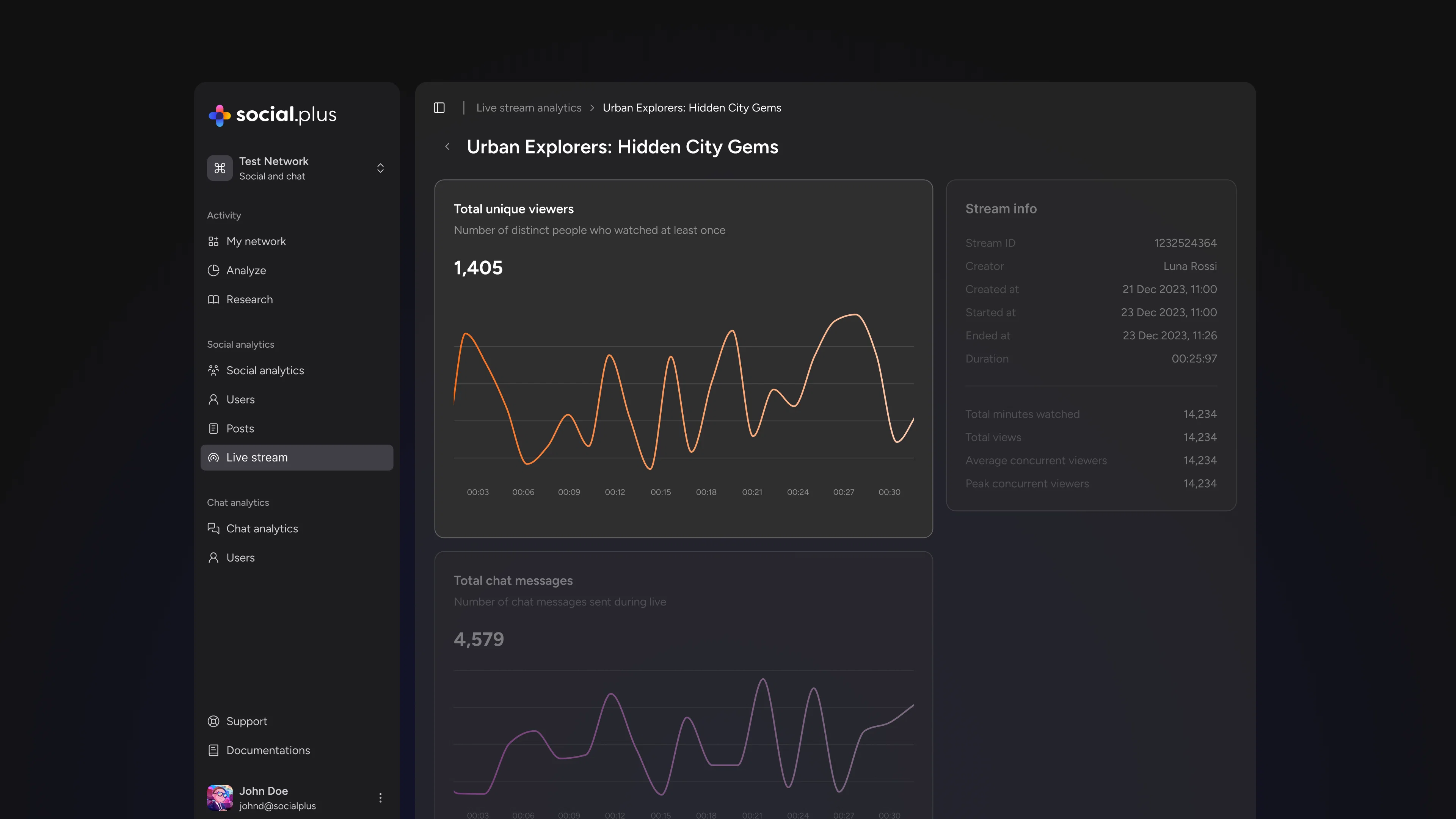
Minutes Watched Per User is your summary verdict. The minute-by-minute viewer timeline is your explanation.
When you pull up the timeline for an individual stream and map where viewers entered, where they dropped, and where engagement spiked, you are looking at a precise record of what your content did to people in real time. This is where abstract performance data becomes a concrete production guide.
Look at the opening two minutes first. This is consistently where the most consequential drop-off happens.This is the 'nose' of the engagement curve, the period when viewers who are not immediately engaged exit, while those who stay are genuinely interested. A steep drop here is a hook problem, not a content problem. The solution is structural: open with the most valuable thing you have to say, not with a setup for it.
Look for mid-stream valleys. A significant drop at a specific timestamp almost always corresponds to a segment transition, a slower explanatory section, or a moment when the stream lost momentum.
Pay equal attention to spikes. The timestamps where engagement was held or climbed are as instructive as the valleys. A live Q&A segment that consistently produces retention spikes across multiple streams is telling you your audience values interaction. A product demo that shows strong retention compared to your talking-head segments is telling you that visual, tangible content works better for this audience than explanation alone. Even brief streamer absences, stepping away for a break, produced an average 5% viewer drop, which shows just how sensitive live audiences are to the energy and presence of the host.
Five Ways to Move the Number
Understanding what Minutes Watched Per User measures is the first half of the work. Here is the second half: specific, actionable changes that reliably improve it.
- Open with value, not setup. The single highest-leverage change most streams can make is to lead with the most useful or compelling thing in the entire stream. Do not warm up to it. Start there. The audience who stays for the opening minute is almost always the audience you keep.
- Build in pattern interrupts before drop-off points. Once you have a few streams of minute-by-minute data, you will start to see predictable drop-off moments. The strategy is to introduce a change in energy, format, or visual just before that moment, not at it. A new segment, a question to the audience, a visual shift. The goal is to reset attention before it drifts, not to rescue viewers who have already left.
- Give viewers a reason to stay beyond the current moment. Previewing something coming later in the stream, 'in about 15 minutes we are going to show you X,' creates an open loop that pulls viewers forward. This is a technique well established in broadcast production and it works just as effectively in live streaming.
- Make the stream interactive at the moments you need it most. Audience questions, polls, and direct acknowledgment of chat are not just engagement tactics, they are retention mechanics. A viewer who is actively participating is not passively considering whether to leave. Structure your interactive moments around timestamps where your data shows you typically lose people.
- Audit your endings. One of the most consistent findings in video retention research is that signaling the end of valuable content, phrases like 'to wrap things up' or 'just to summarize', triggers immediate drop-off. End your streams on substance, not on wind-down. The last thing a viewer experiences shapes whether they come back for the next one.
Where to Find This in Livestream Analytics
Livestream Analytics surfaces Minutes Watched Per User across your full stream history, alongside the percent-change comparisons that show you whether the number is moving in the right direction over time.
For the minute-by-minute detail, select any individual stream from the list. The viewer timeline shows you exactly when people tuned in, when they dropped off, and when engagement spiked, all mapped to the actual timestamps of your stream.
The data is there. The question is what you do with it after every stream. Teams that build a habit of reviewing these two views together, the summary metric and the timeline breakdown, are the ones that improve consistently rather than just streaming more.